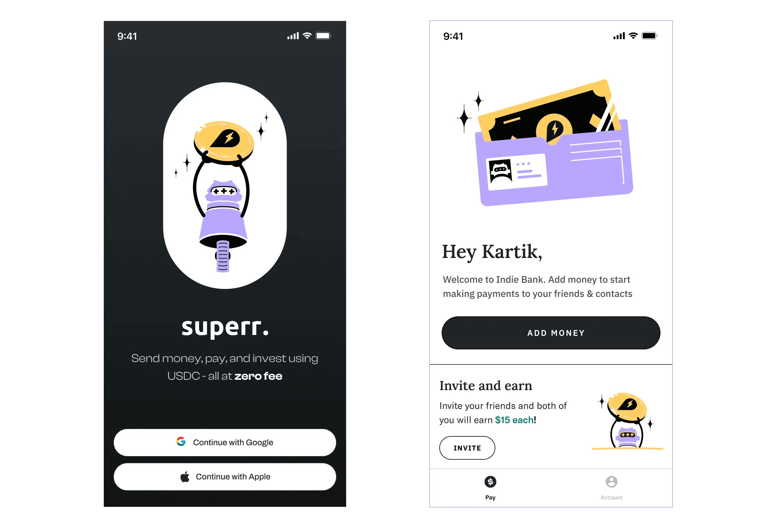
Superr
Crypto Payment App
The Project
The Visual identity for US-based Cryptocurrency Payment App.
The Team
I did the identity, Illustration and Motion. Kartik Tyagi was the principal designer for the ui/ux on the app. Anish Soni assisted me with some initial explorations for the logo and Illustrations
Defining The Brand Personality
Superr is a payment app. It was envisioned to be a safe, comfortable choice for quick payments for everyone.
We more or less knew the personality for Superr. The process involved less brainstorming and more just defining what we already knew.
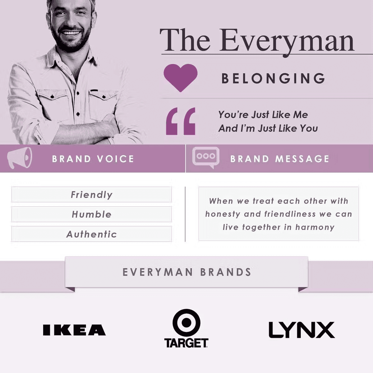
The Everyman
The Everyman represents a brand for the people and offers a sense a belonging.
It was the perfect fit for Superr envisioned as a reliable friend and confidant.
Defining The Brand Personality
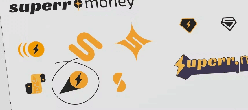
2. Creating an Identity
From the get-go, the name evokes superhero imagery but Superr is less Superman, and more friendly, neighbourhood Spiderman. The challenge here was to create a relatable superhero- anyone who puts on that mask, or in this case, uses the app, should feel empowered.
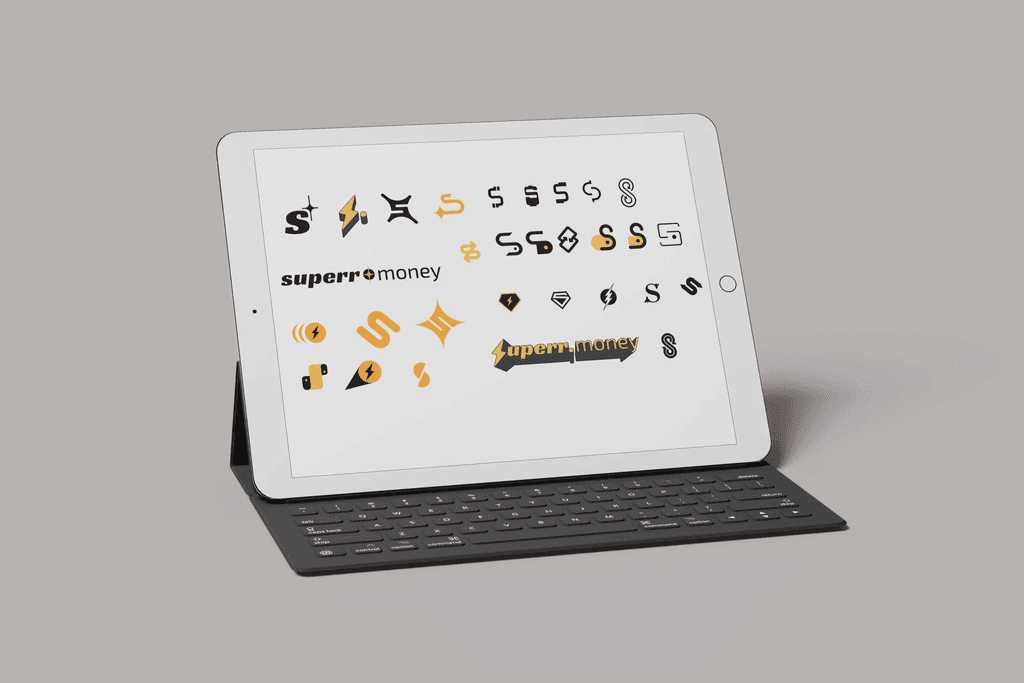
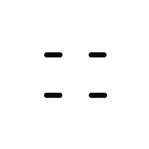
We shortlisted 4 options-
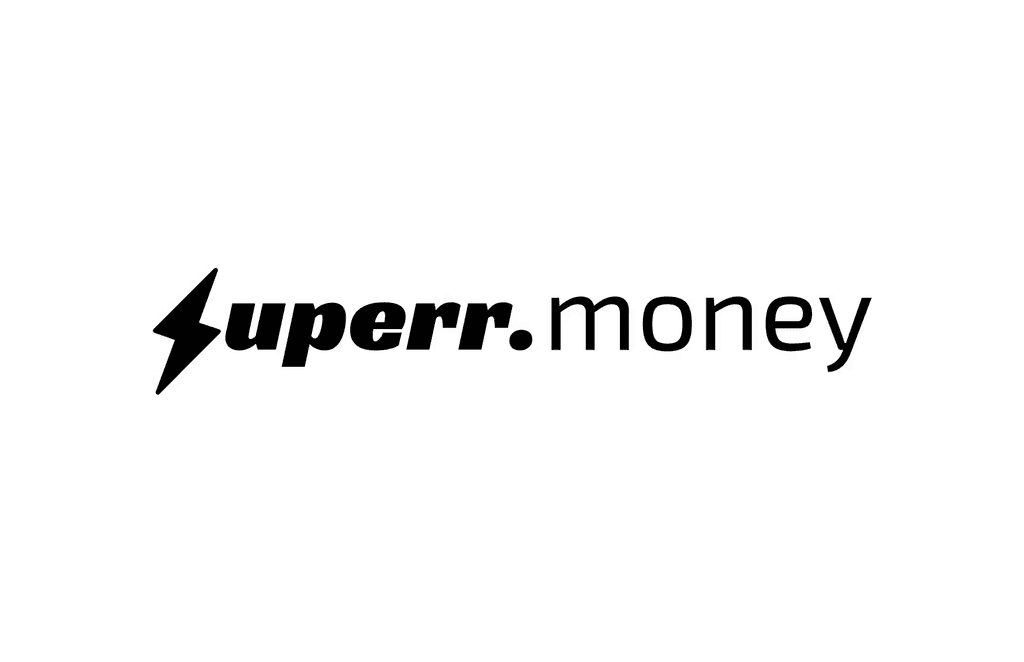
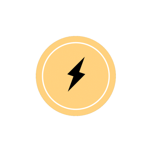
Thunderbolt was my choice but none of the shortlisted options were a go and it was back to the drawing board but while looking back at the older explorations, one in particular stood out. A call sign but not a sigil.
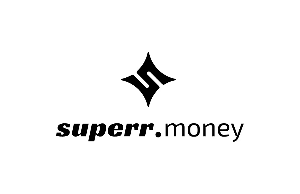
In hindsight, Superr Signal seems like an obvious choice we initially overlooked. The form was unique and fit the idea of the everyman superhero - A sign that exciting and better things are on the way

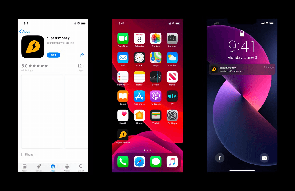
Illustration and Colours
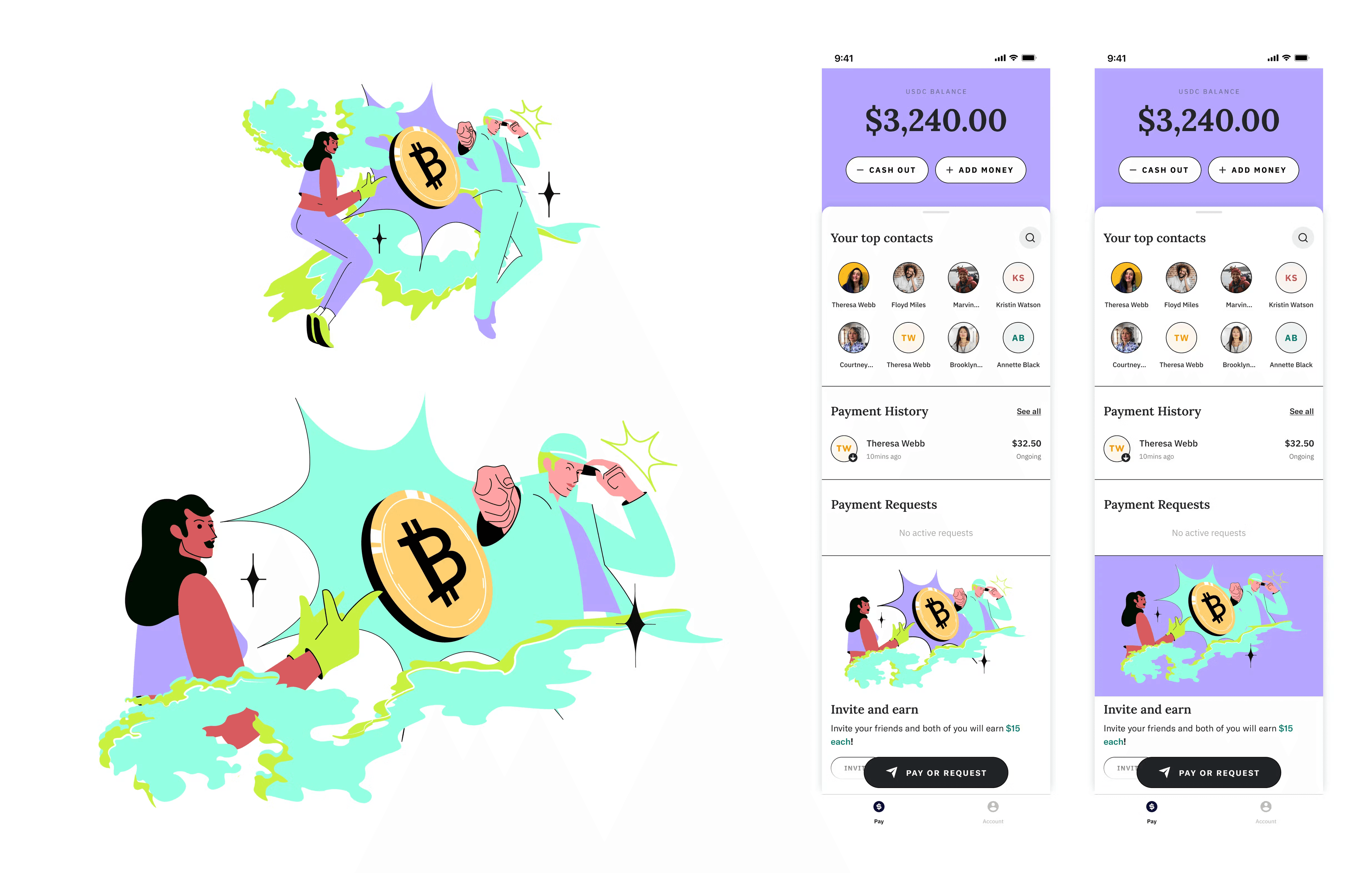
For Superr, it was evident we'd need bright, peppy colours. Luckily a clear starting point was the yellow torchlight of our logo which lead to a complimentary purple and from there on, other matching hues. The most exciting part of Superr was the use of characters. I referenced some of my favourite mascots and anime characters.
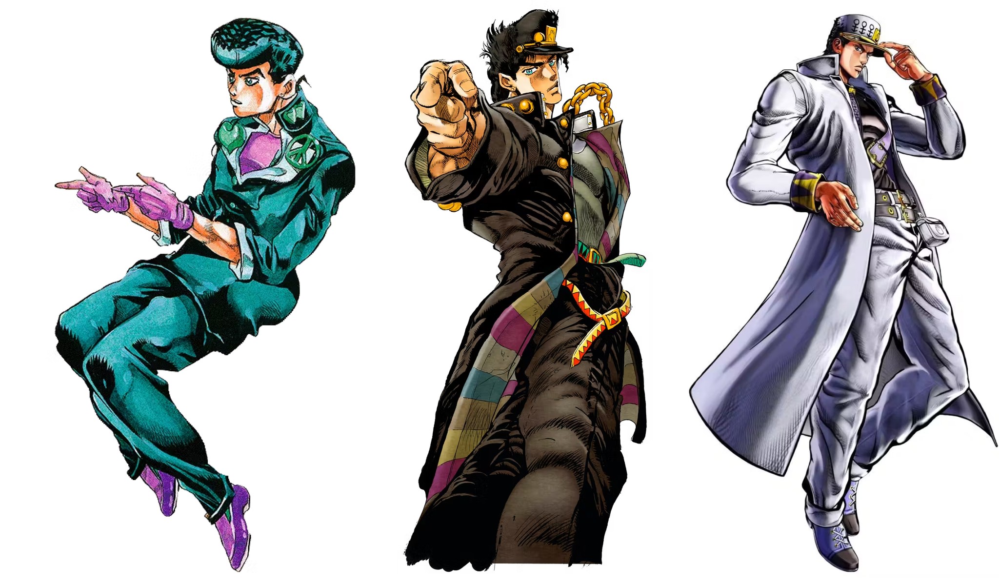
Jojo Pose references
I created explorations based on Jojo, which we scrapped because of the level of detail and complexity but I took the playful vibe and colours forward.
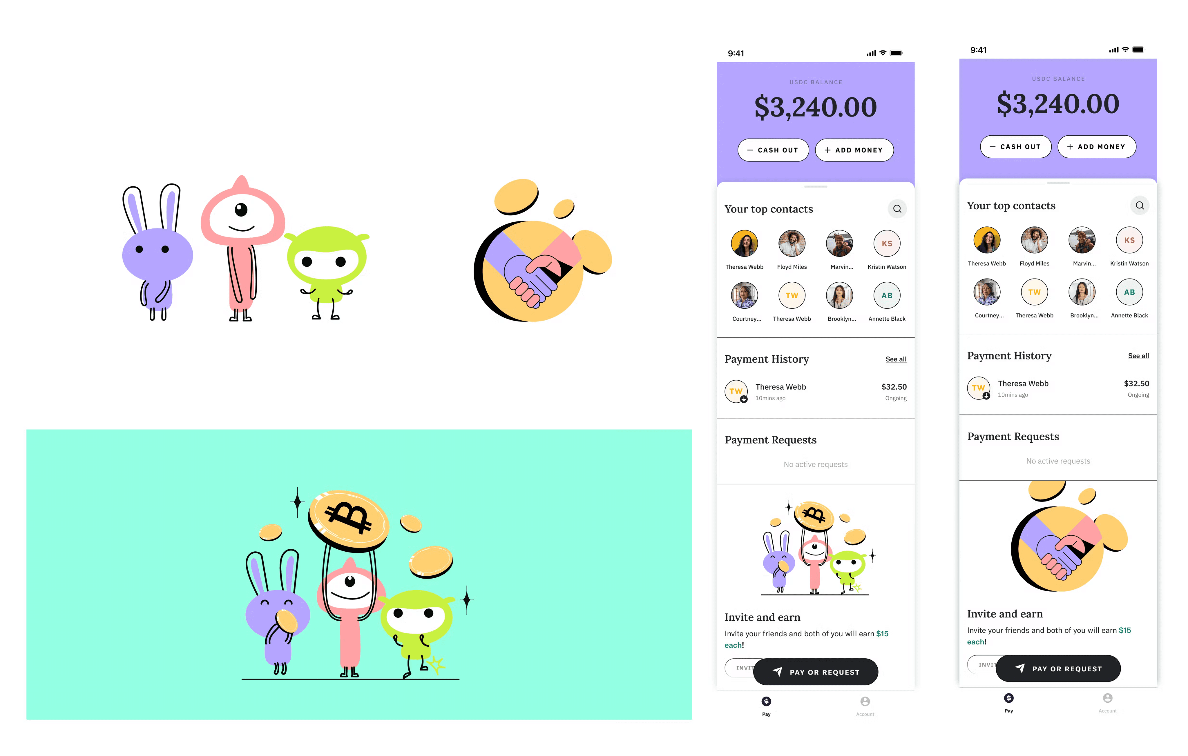
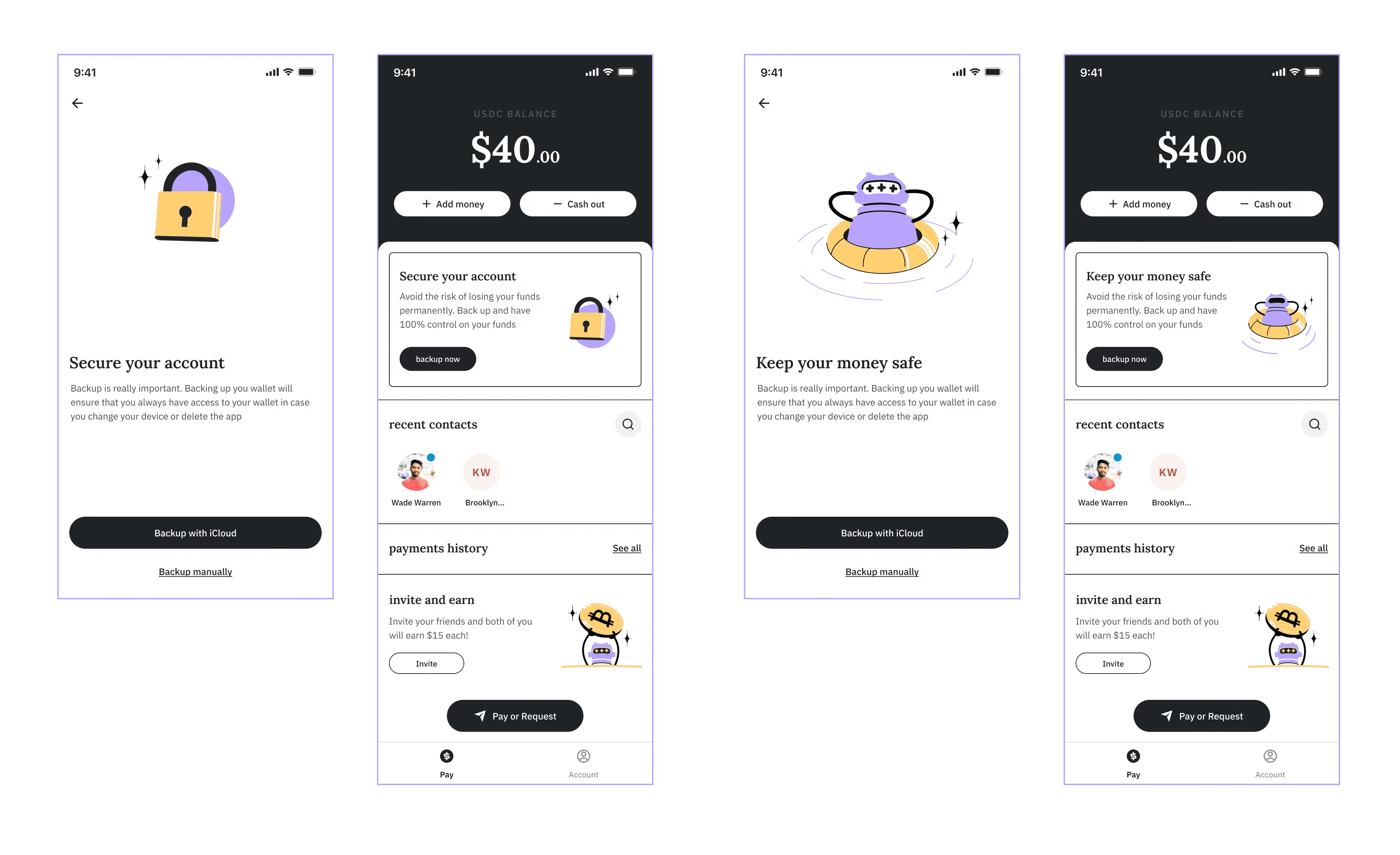
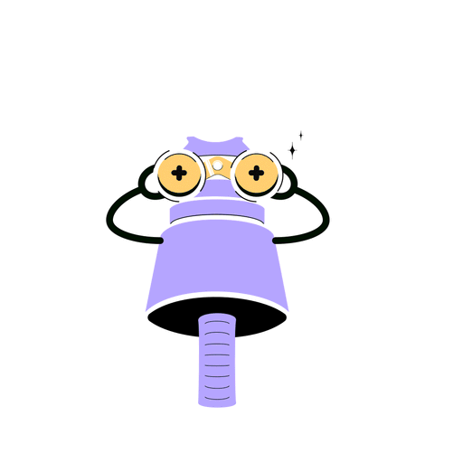
We eventually converged on this friendly, adorable and sort of mechanical robot.
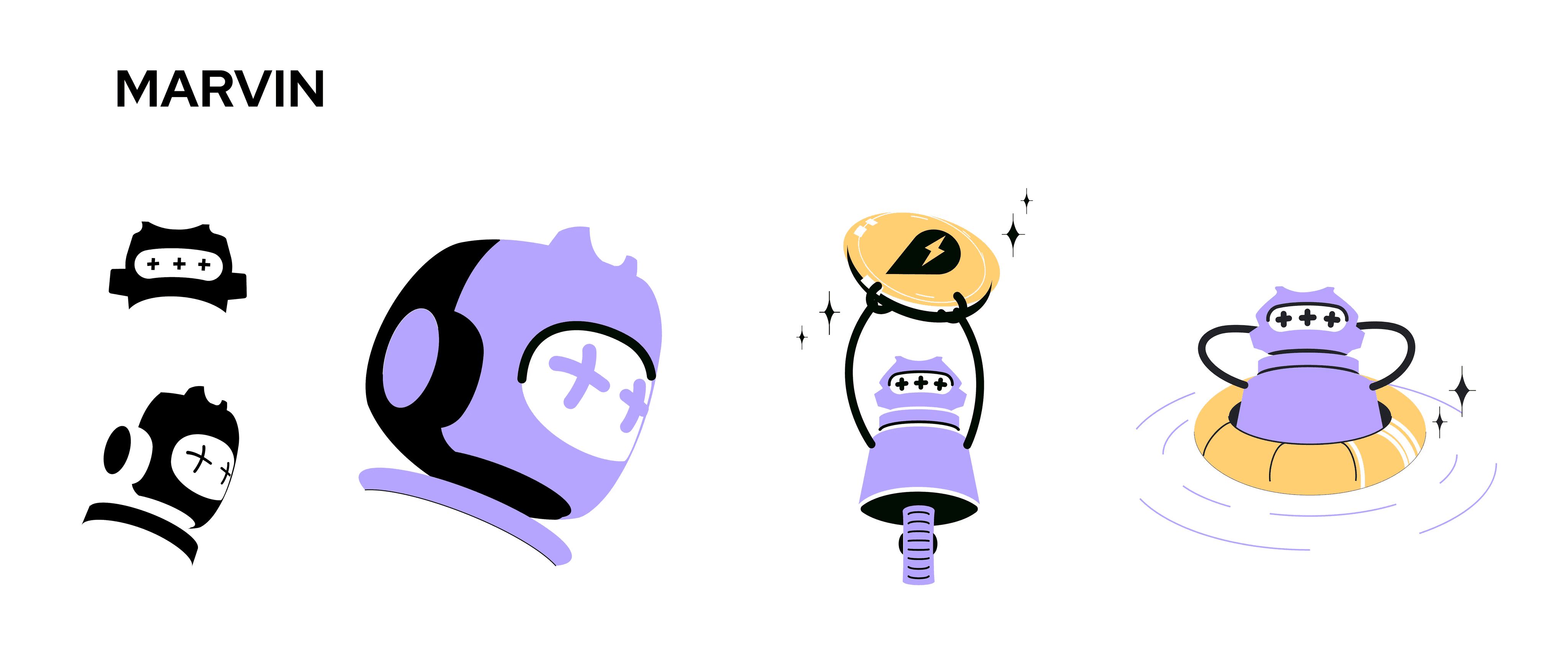
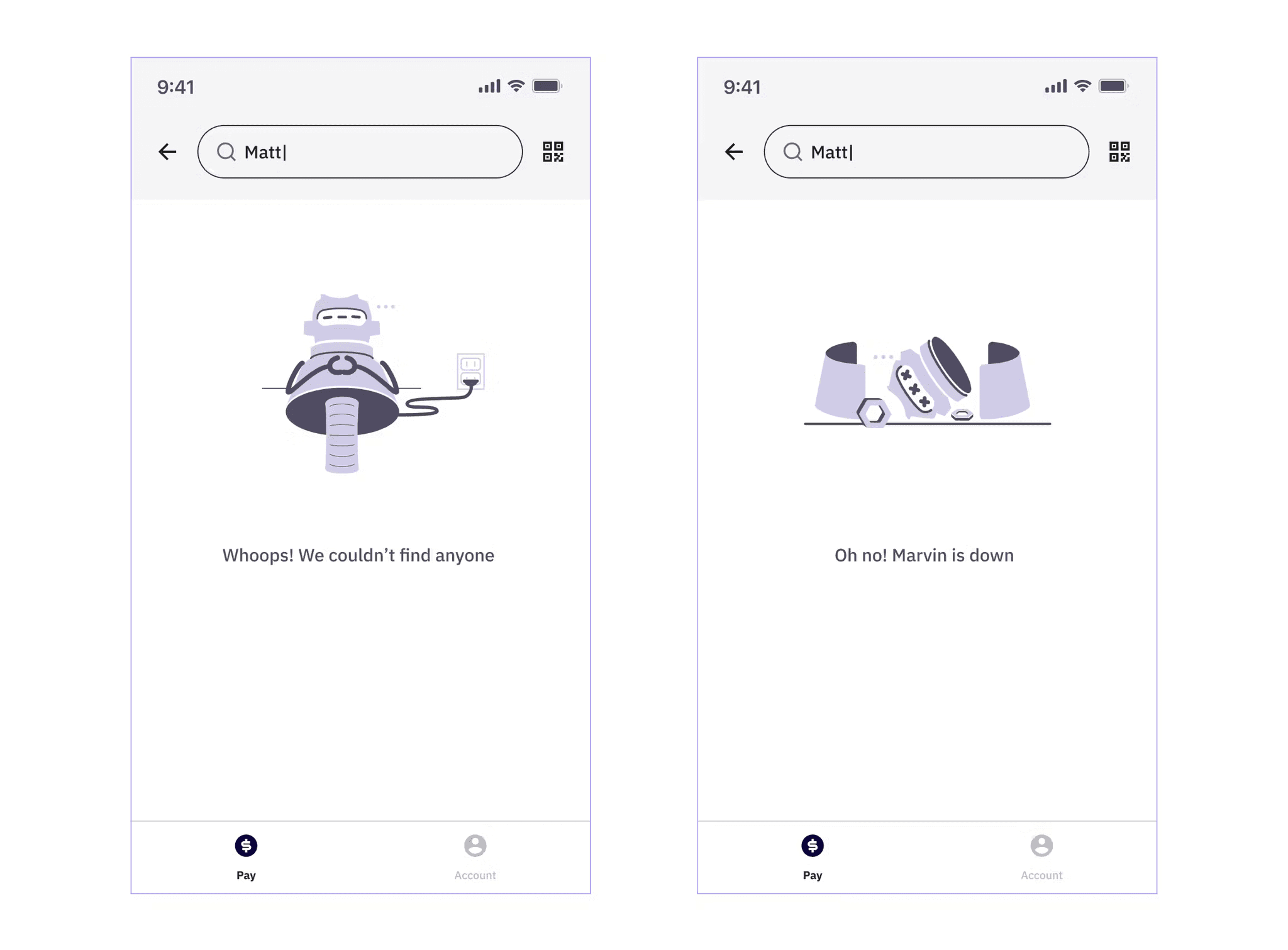
Meet Marvin.
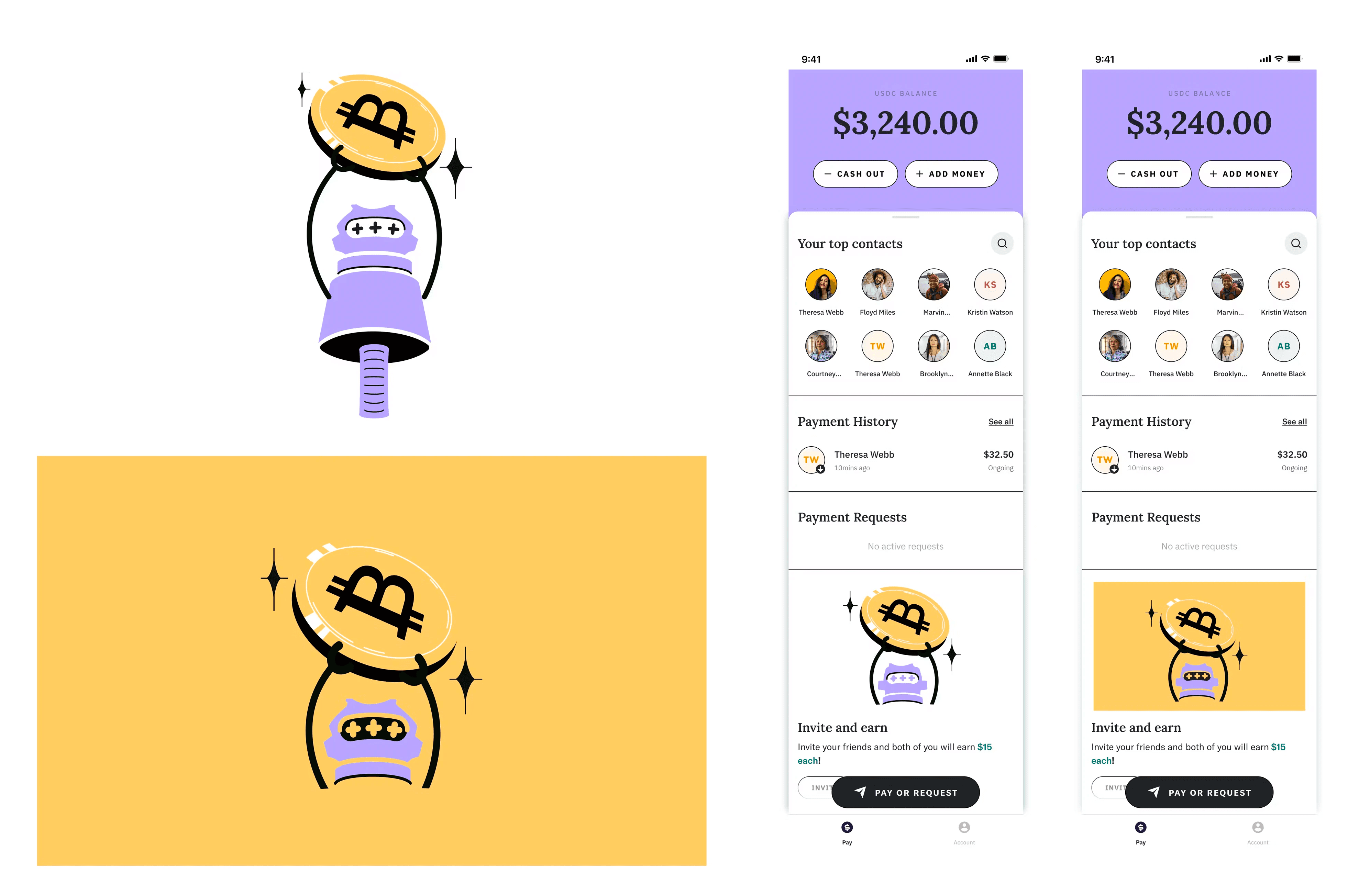
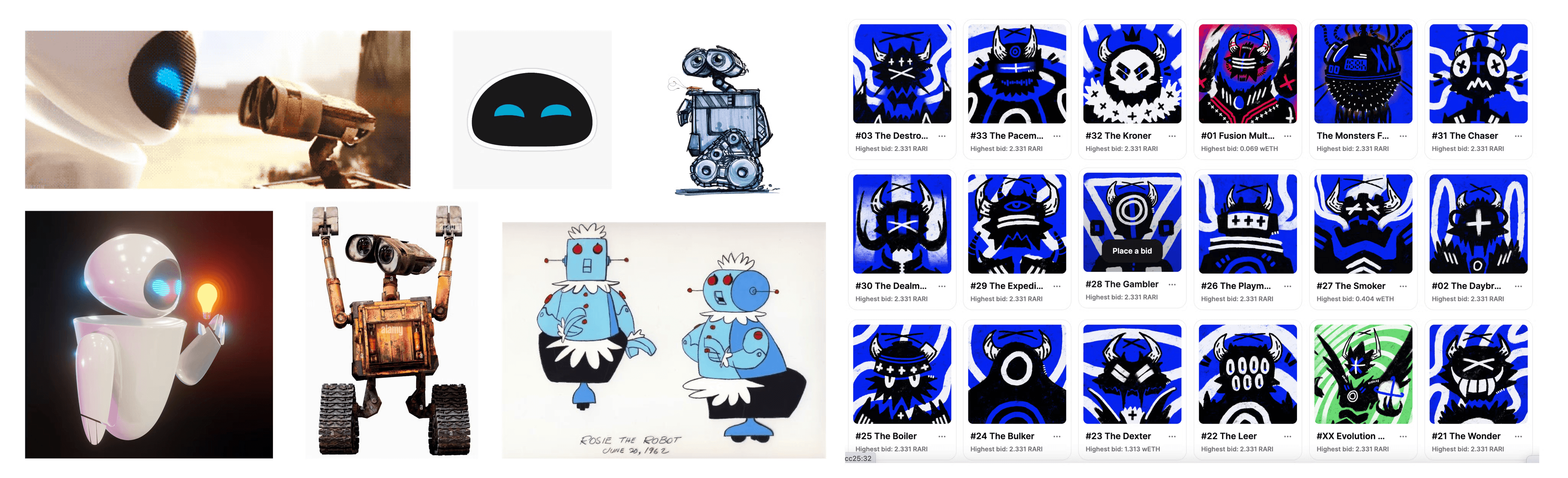
Marvin would serve as a friend and guide through the crypto journey of our users. He’s based on multiple sources of inspiration -Rosie, The robot from The Jetsons; Eve and Wall — E; and one of my favourite NFT projects, Monsters on Rarible.
Marvin’s face structure has the likeness of Monsters, his personality is like Wall-e’s, his body structure is like Rosie and his visor is like Eves’.
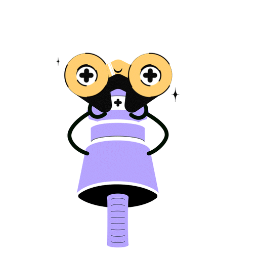
While present on the app in front view and a flat style, I also experimented with how he would look in perspective (based on Eve from Wall-e).
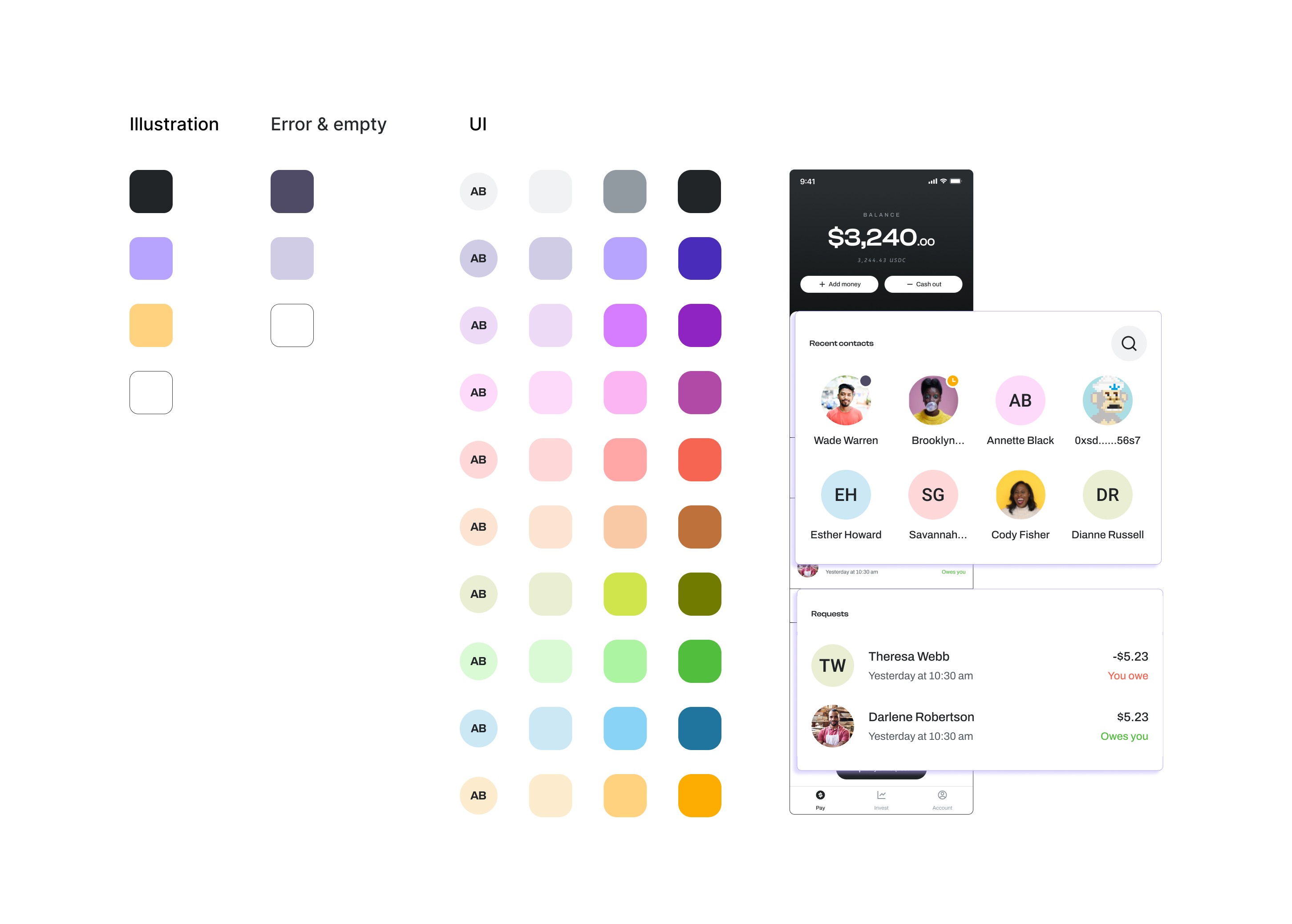
I explored extensive colour palettes for Superr, creating an extended palette for the UI derived from the illustration palette. The most challenging aspect was ensuring the selected colour combinations adhered to AAA contrast guidelines.
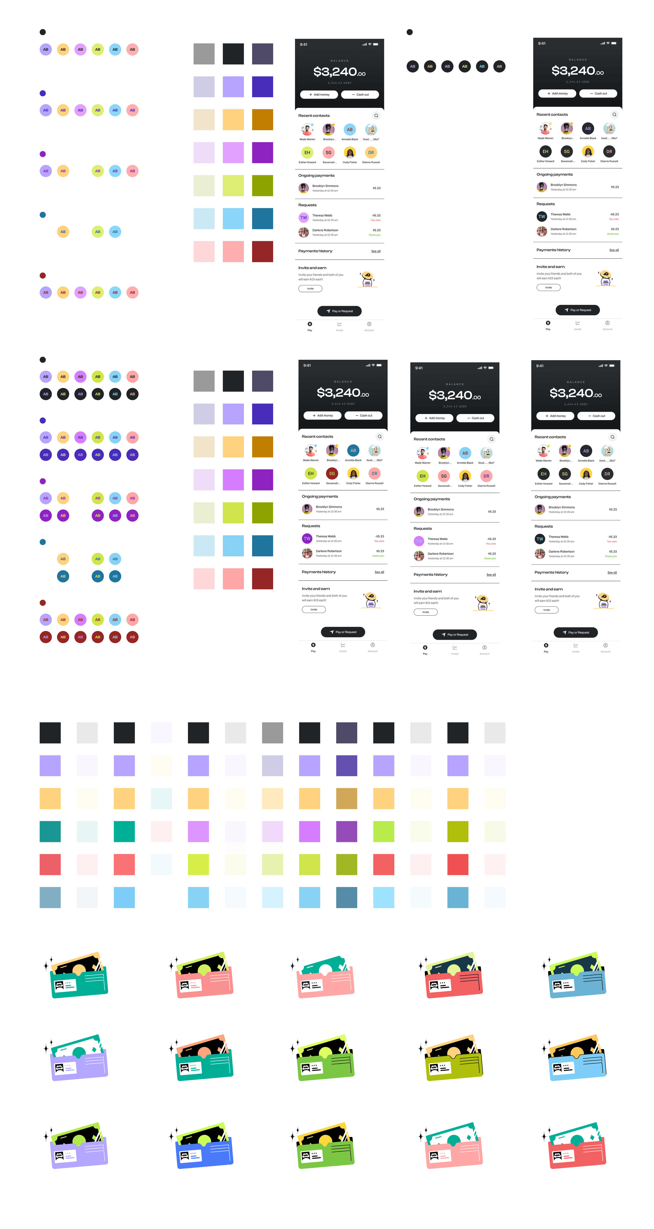
We toyed with some rich hues eventually circling back to the original purple-yellow complimentary scheme when this began overwhelming our Ui. We reserved the colourful palette for contacts and not the high DAU pages
Motion Graphics
The motion for Superr was created around Marvin. Like Marvin, the animation also incorporated very mechanical characteristics in a playful manner.
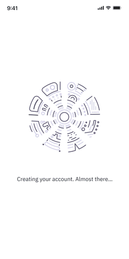
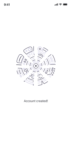
Account Opening Animation
I created a line drawing of a vault of sorts which turns mimicking the movement of a combination dial lock. The animation turns in circles while the user waits for the account creation. When complete, the dial locks into place with the success state popping up.
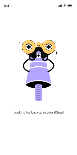
Back Up Animation
This next animation is one of my favourites. It shows Marvin looking for a backup.
In the first iteration, the movement wasn't very evident and i was concerned the user might feel like they’re waiting on a seemingly static page.
A little bobbing movement makes it seem like Marvin is extending his neck in search of a backup
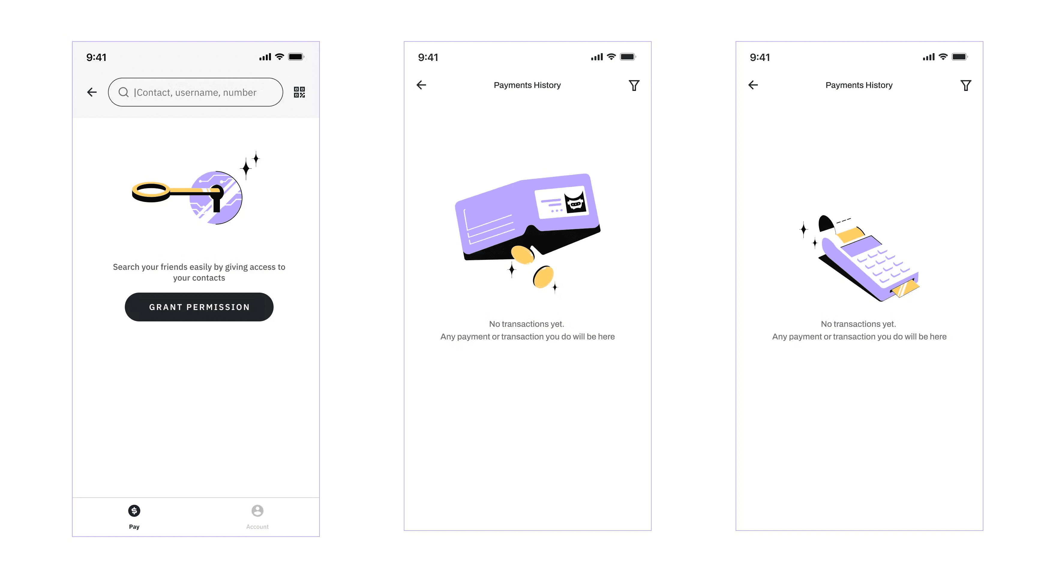
General Loading state
I approached the general loading and success/failuire states at the end.
I went through multiple animations, hoping to create a recall to Marvin’s eyes.
Not one person made the connection and the use case was the success/failure states were also removed on account of the loading being relatively long.
I finally created a loop of a coin rotating in place. You may recognise the coin itself from our add money illustration but to create a little brand recall, I added a hint of the logo.
On the overall, a very cute and colourful project to work on
I'm Nayna Yadav and I like making things beautiful.
I did my undergraduate in Industrial Design from Symbiosis, worked for two years trying different things and then, did a Maters in Communication Design from IDC IITB. Since then I've worked as a Visual Designer, an Assistant Professor, a Creative Director, and a Product Designer.
I like doing new things.
If have something fun you'd like to collaborate on, shoot me a message on naynabcd@gmail.com