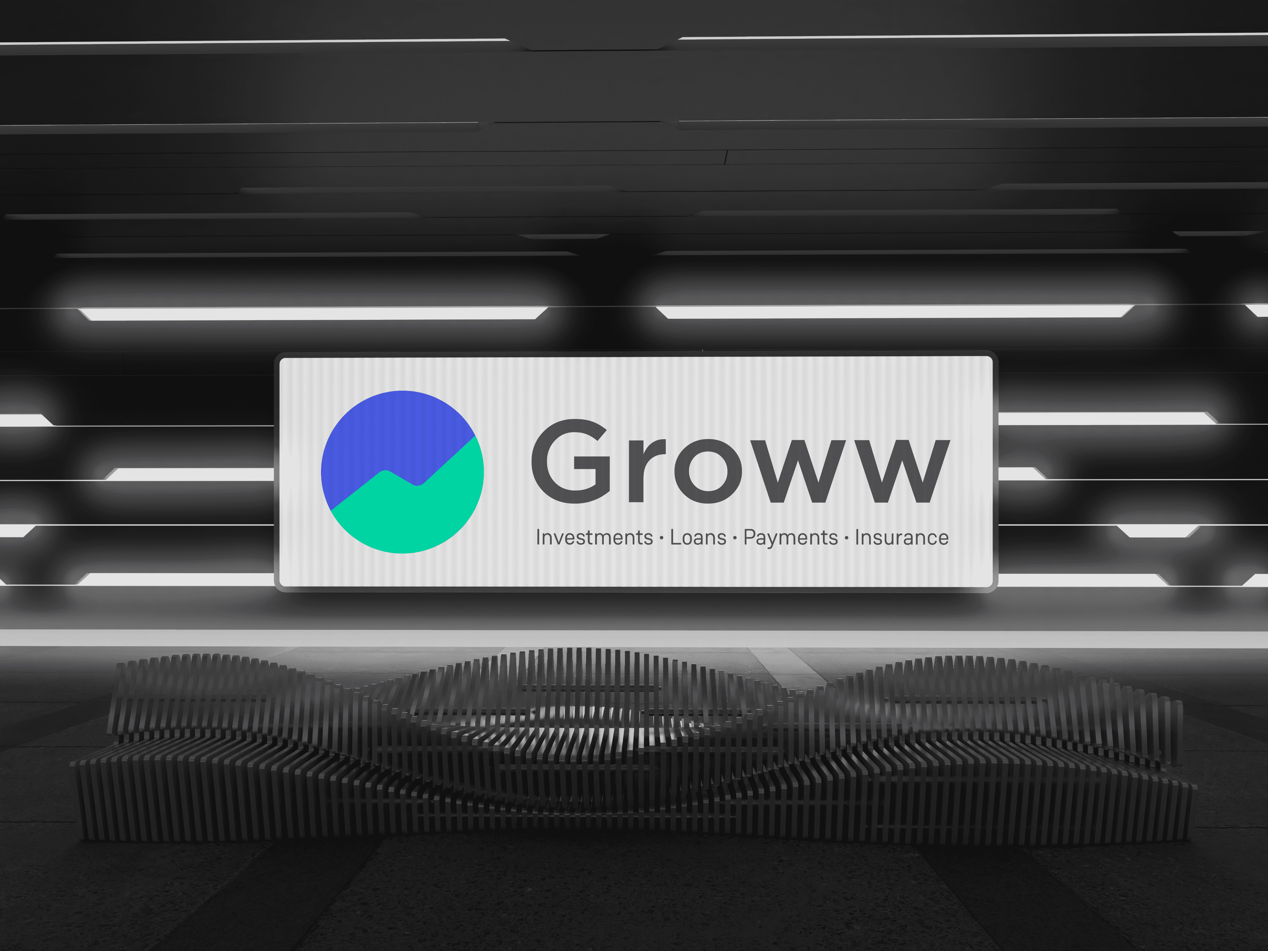
Groww
Refresh
Why?
Improving design and accessibility
Consistency across an expanding product range
A reset point for an evolving brand
What?
Logo
Colour
Typeface
Logo
1.1 Form and construction
1.2 Lock Ups
1.3 Sub Brands System
1.1 Form and construction
Why?
Not representative of a mature brand
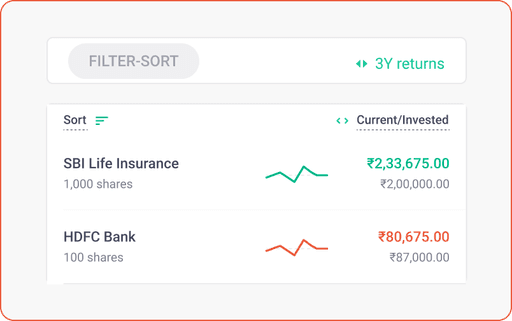
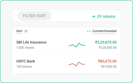
Groww is more than just charts
Technical issues
Construction
Single Colour
Scaling
~presenting~
THE SUMMIT
The Summit
Reaching for the peak
Representative of more than charts
Striving to reach greater heights
Clean, Simple, Groww
Construction
Single Colour
Scaling
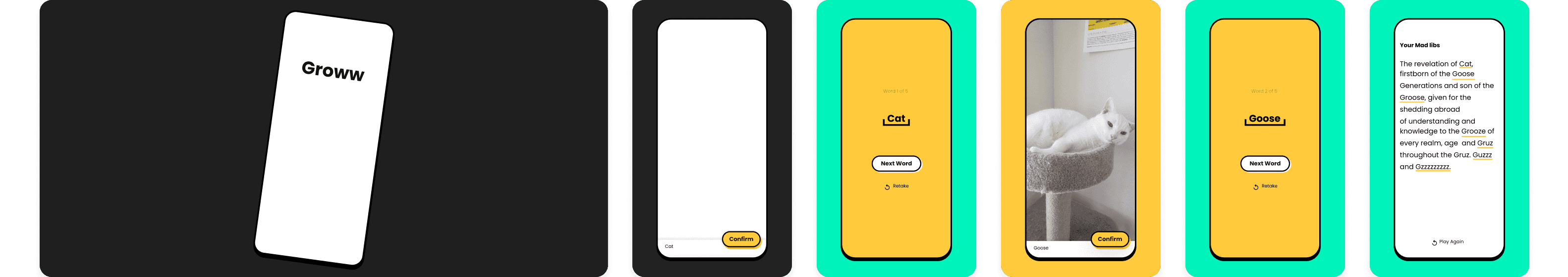
3:50
Groww Stocks & SIP
Groww
4.7
1k reivews
100K+
Downloads
Everyone
Install
About this app
Groww stocks and mututal funds
Ratings and reviews
Games
4.7
5
4
3
2
1
1,265


Follow
Best logo ever!
@groww_in
Groww
Highlight
Highlight
Highlight
Highlight
Message
Follow
groww.in
Financial Services
Local Business
Groww
29
Posts
334
Followers
230
Following
user_name
Mutual Fund
REWARD CARD
CREDIT Serv
Black Card
1.2 Lock Ups
Why?
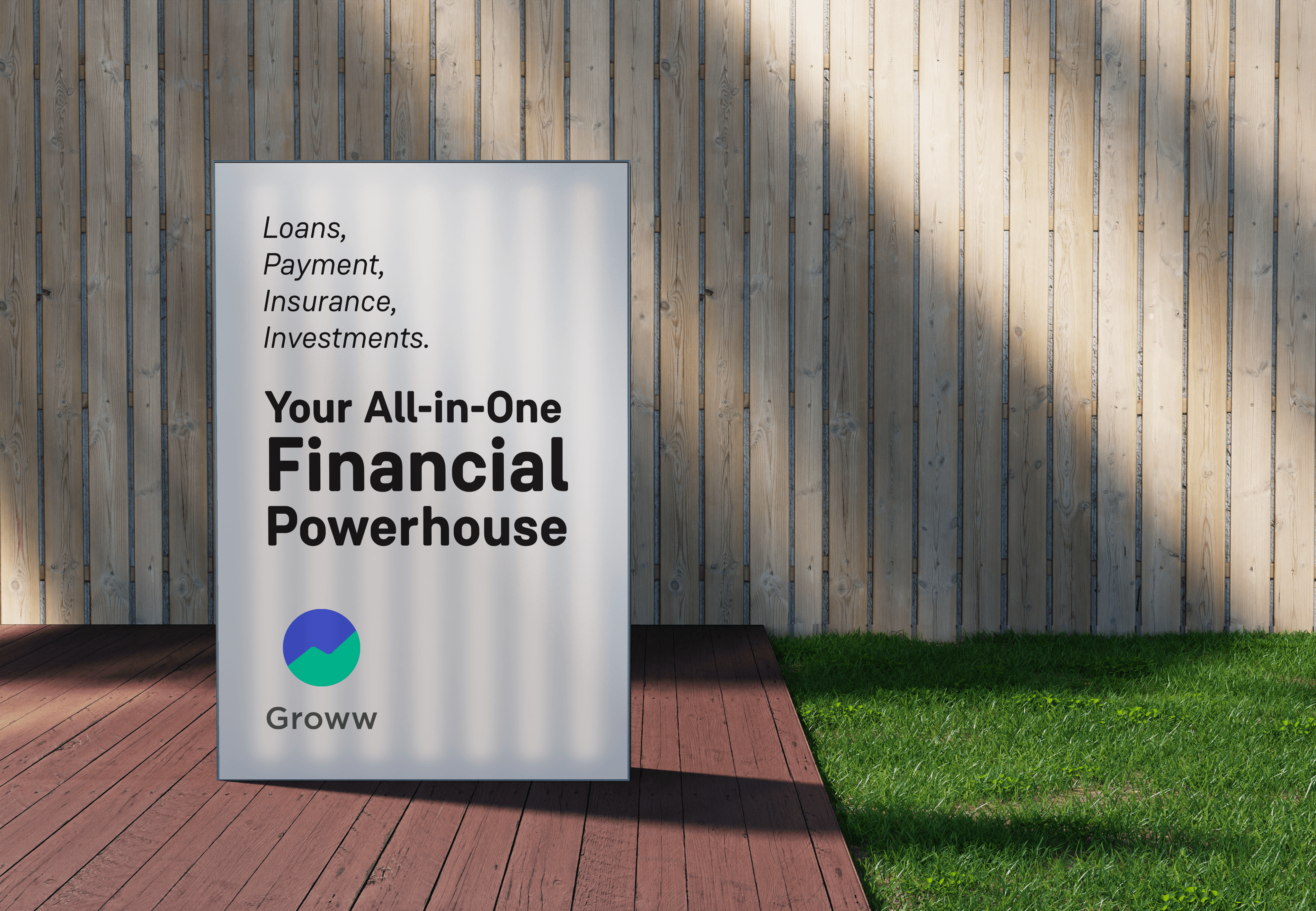
An Identifiable Brand Framework
Swift expansion to new Products
Lending brand confidence to new Products
What?
A top down system
All sub brands/products are informed by the parent brand, Groww.
Groww brand and ethos dictates how our products are created and perceived.
How?
A Breakpoints System
Homogeneity
Within the Brand and its Products
eg. Local language versions of Groww logo and Sub Brand logos
Scalability
For sub brands/ products
eg. For New Brands and sub brands within them
The Primary lockup
Horizontal
Mainly used for rectangular formats
eg - Website, letterheads, business cards, sponsorship products.
The Secondary lockup
Vertical
Used for square layout formats.
When a larger emphasis is needed on the logomark such as events or branding opportunities.
eg - t-shirts, advertising banners, signboards.
Primary Lockup
Secondary Lockup
1.3 Sub Brands System
Groww Products
All sub brands/products are informed by the parent brand, Groww.
Groww brand and ethos dictates how products are created and perceived.
Multiple lockups give a brand flexibility

Hortizontal Lockup
Horizontal lockup 1
Groww Logomark + groww Wordmark + Product
public facing
Horizontal lockup 2
Groww Logomark + Product
Within app
Vertical Lockup
vertical lockup 1
Groww Logomark + groww Wordmark + Product
public facing
vertical lockup 2
Groww Logomark + Product
Within app
Text Lockup
Defining the brand in text
A standardised way to present the brand in copy, in blogs, in documents and on the web.
Groww Sentence Case
< Single Space >
Product in Sentence Case

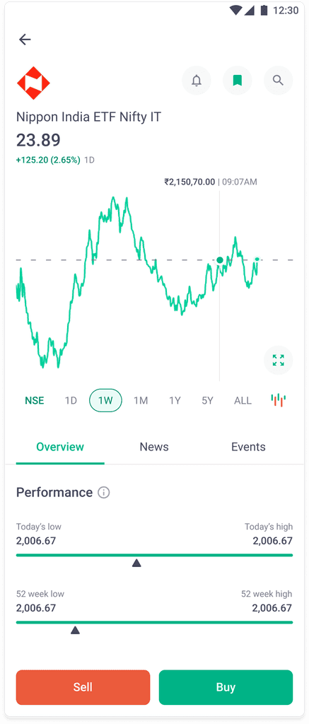
2. Colour
Making content more accessible
Why?
People are changing their phone settings to because our green does not provide enough contrast
Current Interface
Customer Modifications
Contrast
Content Green
Small text
Content Green
Layering
Content Green + bg green
What?
Improving contrast based on APCA (Accessible Perceptual Contrast Algorithm). It's a minute change that will improve legibility while not creating noticeable change in brand perception.
Current Green
#00D09C
A
Fail
Lc -38
A
Fail
Lc 42.4
Orders
3
Add money
PAY
Deposit
New Green
#00B386
A
Pass
Lc -56.8
A
Pass
Lc 51.6
Orders
3
Add money
PAY
Deposit
Contrast
Content Green
Small text
Content Green
Layering
Content Green + bg green
Current Interface
New Modifications
Current Interface
New Modifications
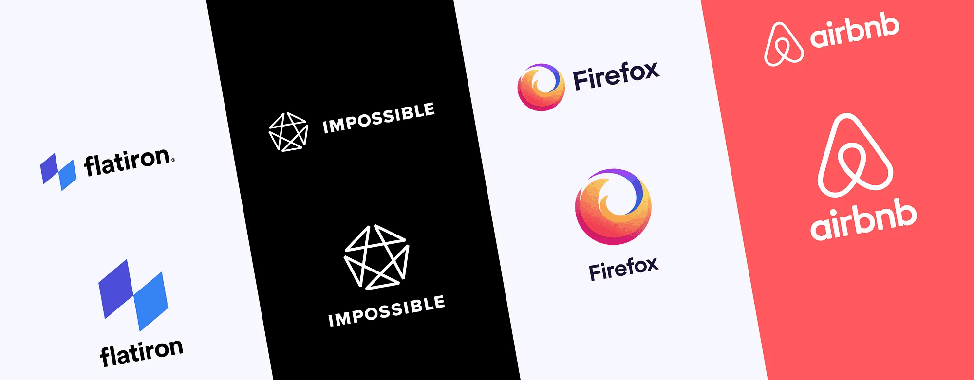
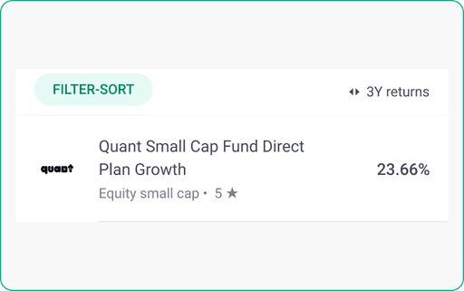
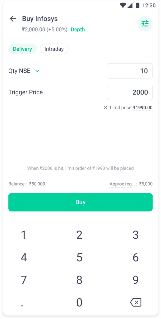
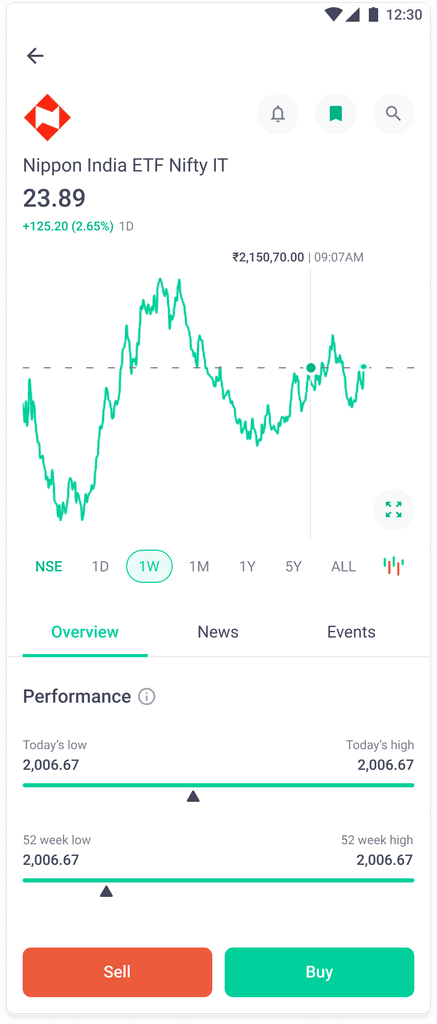
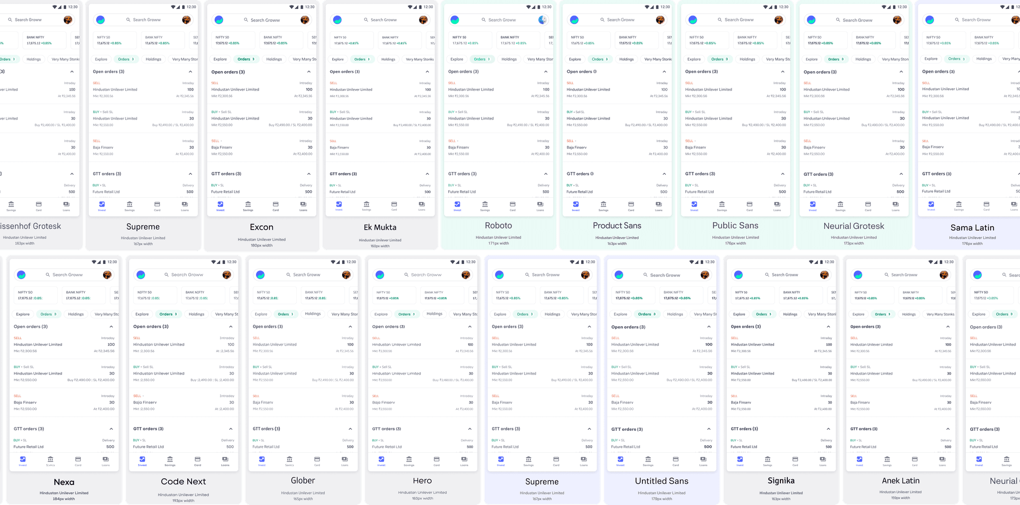
3. Typeface
Owning Our Identity
Why?

Moving from Roboto
• Has no identity
• Common san serif android font
• Everyone and no one recognises Roboto.
great brands
are built on
great
type
Owning A Great Identity starts with owning a Great Typeface
~ Presenting ~
Groww Sans
Based on Weissenhof Grotesk by ITF
Groww Sans is a constructed geometric sans serif font.
• An easy, clean transition from Roboto
• A distinct visual identity
• Custom weights
• Performs well across data, text and UI
• A narrow yet legible typeface that will help us with data
8 styles + Variable Weights
Light
Regular
Medium
Bold
Light Italic
Italic
Medium Italic
Bold Italic
Tabular lining figures
6,113,210
3,323,210
1,223,000
6,333,222
Groww Sans Light
Light Italic
Together we Groww
Liquid Fund Direct Growth
₹1,32,10,323
Together we Groww
Liquid Fund Direct Growth
₹1,32,10,323
AaAa
Groww Sans Regular
Groww Sans Medium
Groww Sans Bold
Together we Groww
Liquid Fund Direct Growth
₹1,32,10,323
Together we Groww
Liquid Fund Direct Growth
₹1,32,10,323
BbBb
Medium Italic
Together we Groww
Liquid Fund Direct Growth
₹1,32,10,323
Together we Groww
Liquid Fund Direct Growth
₹1,32,10,323
CcCc
Italic
Bold Italic
Together we Groww
Liquid Fund Direct Growth
₹1,32,10,323
Together we Groww
Liquid Fund Direct Growth
₹1,32,10,323
DdDd
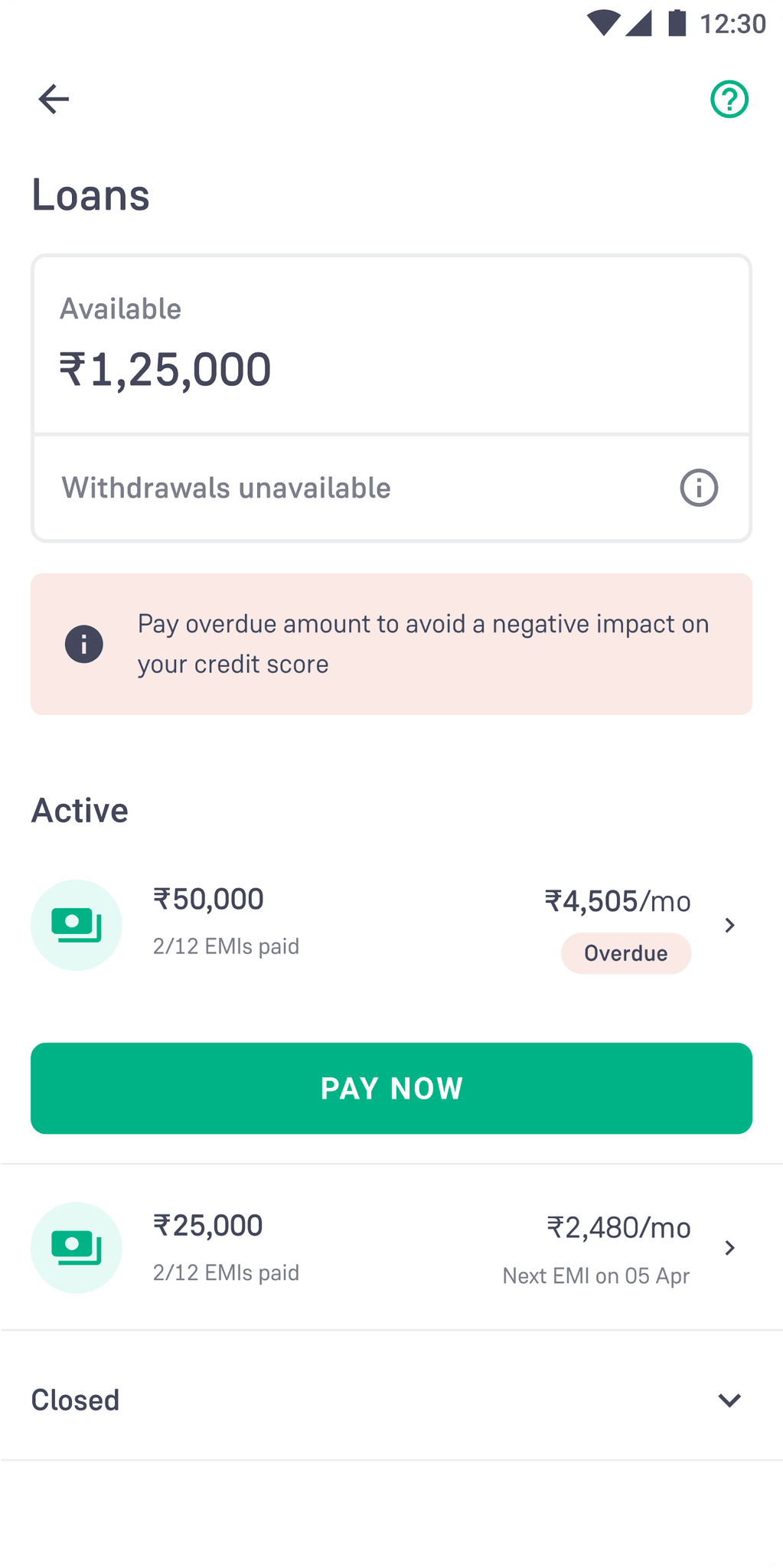
Current Interface
New Modifications
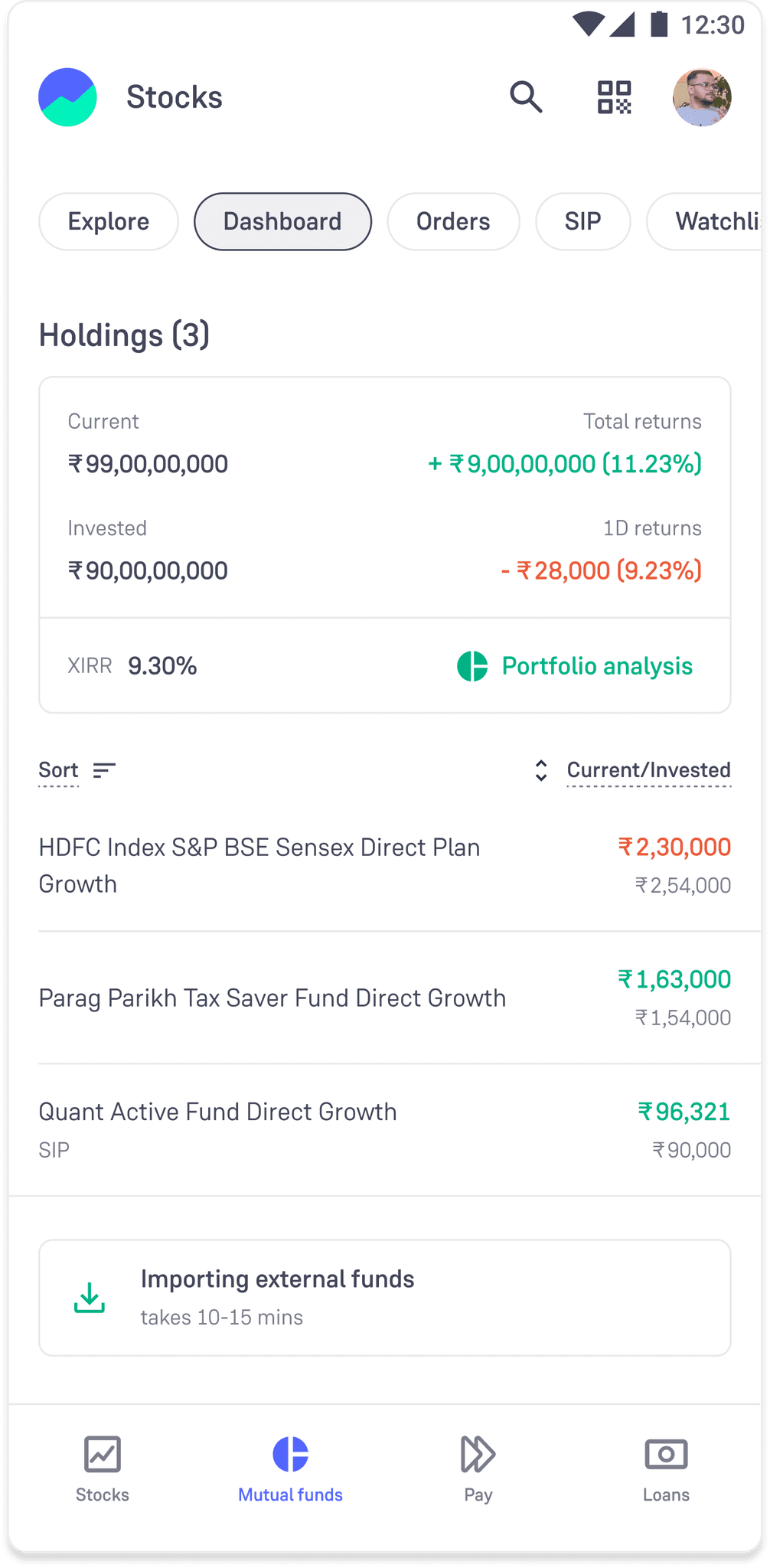
Current Interface
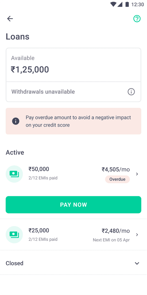
New Modifications
I'm Nayna Yadav and I like making things beautiful.
I did my undergraduate in Industrial Design from Symbiosis, worked for two years trying different things and then, did a Maters in Communication Design from IDC IITB. Since then I've worked as a Visual Designer, an Assistant Professor, a Creative Director, and a Product Designer.
I like doing new things.
If have something fun you'd like to collaborate on, shoot me a message on naynabcd@gmail.com